Used together, they form a decision-support pipeline. Used in isolation — or confused with each other — they produce reports that look authoritative but drive very little action.
Despite how frequently both terms appear in B2B conversations, operational teams often lack a clear picture of how the process actually works, what infrastructure it requires, and where it creates the most value. This article addresses all three.
Key Takeaways
- Analytics produces the insight; visualization communicates it. Treating them as interchangeable terms leads to skipped steps and unreliable outputs.
- There are four types of analytics: descriptive, diagnostic, predictive, and prescriptive — most B2B teams only use the first.
- Visualization tools like Power BI or Tableau require clean, structured data to produce reliable outputs — selecting a tool before fixing data quality guarantees poor results.
- According to Forrester, only 48% of business decisions were informed by quantitative data in 2022 — even as enterprise data literacy programmes expanded.
- APP-compliant data architecture must be scoped at the start of any analytics project, not reviewed after go-live.
What Are Data Analytics and Visualization?
Data analytics is the structured process of collecting, cleaning, and examining data to extract actionable insights that support decision-making. It involves asking a defined business question, choosing the right analytical method, and producing a finding that holds up under scrutiny.
Data visualization is the graphical representation of analysed data using charts, graphs, maps, or dashboards. Its purpose is to make findings accessible across teams — including those without a technical background — so that insights can be acted on without reading raw data directly.
The two are sequential, not interchangeable: analytics produces the insight, and visualization communicates it. Deploying a dashboard before the underlying data has been properly structured and analysed is one of the most common mistakes B2B teams make — and one of the easiest to avoid.
The Four Types of Data Analytics
Gartner identifies four progressive types, each answering a more strategic question than the last:
| Type | Business Question | B2B Example |
|---|---|---|
| Descriptive | What happened? | Monthly revenue summary by region |
| Diagnostic | Why did it happen? | Why churn increased in Q3 |
| Predictive | What is likely to happen? | Forecasting next quarter's pipeline close rate |
| Prescriptive | What should we do? | Which customer segment to prioritise for retention spend |
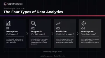
Most B2B teams operate primarily at the descriptive level. That is a reasonable starting point, but predictive and prescriptive analysis is where data begins to directly influence strategy rather than just reporting on it.
Common Visualization Formats B2B Teams Use
- Bar charts — comparing performance across categories (e.g., revenue by channel)
- Line charts — showing trends over time (e.g., monthly active users)
- Pie charts — illustrating proportions within a whole (e.g., budget allocation by department)
- Scatter plots — revealing the relationship between two variables (e.g., deal size vs. close time)
- Dashboards — a collection of live visualizations tied to business KPIs, updated from connected data sources
Why B2B Teams Use Data Analytics and Visualization
Cross-functional B2B teams pull data from entirely different systems: CRM, finance, operations, marketing automation. Without an analytics process connecting those sources, each team effectively operates on a different version of reality.
Analytics and visualization address this by creating a single, shared view of performance that everyone can reference before making a decision.
Without that structure, the consequences are predictable:
- Decisions default to the most senior opinion in the room rather than the most accurate data
- Discrepancies between team-level spreadsheets go unnoticed until they cause a material problem
- Risks and opportunities surface weeks after the point where early action would have been most effective
The scale of the adoption gap is worth noting. Wavestone's 2024 survey of 100+ large global organisations found that 48.1% described themselves as having created a data-driven organisation — yet Forrester's separate research shows only 48% of business decisions were actually informed by quantitative data that same period. For most B2B teams, the gap sits in execution: data exists, but it isn't connected, governed, or surfaced at the point where decisions actually get made.
Compliance as a Non-Optional Layer
For B2B teams in regulated sectors, analytics carries compliance obligations that go beyond performance measurement. ASIC's review of AI governance among licensees, REP 798, found that nearly half of the 23 firms examined had no policies addressing consumer fairness or bias — underscoring how data-quality gaps can persist even in regulated environments.
Key compliance requirements for analytics pipelines include:
- The Privacy Act: Data protection by design and by default is a legal requirement — compliance architecture must be scoped at discovery, not reviewed at go-live
- ASIC reporting: Data quality standards apply to the underlying pipeline, not just the final submission
- Audit trails: Regulated sectors require traceable, versioned data lineage to demonstrate accuracy to regulators
How the Data Analytics and Visualization Process Works
The process moves from raw data to structured insight to visual output. Think of it as a pipeline with distinct stages — each must function correctly for the final output to be trustworthy.
The architecture underpinning this pipeline — how data sources connect, where data is stored, how it is accessed — needs to be scoped correctly from the start. For Australian B2B teams handling personal or commercially sensitive data, APP-compliant data architecture is a legal requirement with legal consequences if ignored.
Capital Compute scopes compliance architecture in week one of every engagement, with consent management built from the first sprint. Retrofitting governance after go-live carries measurably higher cost and regulatory risk than addressing it during discovery.
Step 1: Data Collection and Preparation
Teams pull data from relevant sources — CRM platforms, finance systems, marketing tools, operational databases — then clean it to remove duplicates and errors, producing a consistent structure that can be queried reliably.
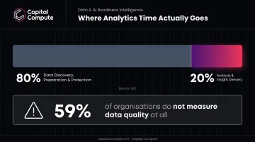
This stage is consistently underestimated. IDC research indicates that 80% of analytics time is spent on data discovery, preparation, and protection, with only 20% spent on actual analysis and insight delivery. Gartner separately reports that 59% of organisations do not measure data quality at all — meaning the majority of B2B teams have no formal mechanism for knowing whether the data feeding their analysis is reliable.
Step 2: Analysis
Once data is prepared, it is analysed using the appropriate type — descriptive, diagnostic, predictive, or prescriptive — depending on the specific business question being asked. The output of this stage is an insight or a set of findings, not yet a visual.
Choosing the right analytical type matters. A team asking "why did churn increase?" needs diagnostic analysis — not a summary report of the churn rate. Applying the wrong method produces an answer to a different question.
Step 3: Visualization and Communication
Findings are translated into visual formats suited to the audience and the decision being made. A board-level summary requires different visualization choices than a weekly operational report for a delivery team.
Effective visualization does three things:
- Removes noise so the key signal is immediately visible
- Makes the next action obvious to a non-technical reader
- Provides a shared reference point that aligns stakeholders before a decision is made
Where B2B Teams Apply Data Analytics and Visualization
The most common application areas across B2B organisations:
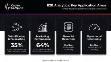
- Sales pipeline and forecasting — tracking deal progression, predicting close rates, identifying where deals stall. Salesforce's 2024 survey of 5,500 sales professionals found only 35% completely trusted their organisation's data, and 39% said poor data quality actively harmed forecasting accuracy.
- Marketing performance — attributing spend to outcomes across channels, measuring campaign ROI, understanding which acquisition sources convert. Forrester's 2024 B2B marketing research found 64% of B2B marketing leaders did not trust their measurement for decisions.
- Financial reporting — monitoring cash flow, margins, and cost centre performance; producing audit-ready reports with consistent figures across periods.
- Operational monitoring — tracking SLA adherence, resource utilisation, and workflow bottlenecks in real time.
Embedded vs. Ad Hoc
Analytics is most effective when embedded into recurring business processes — weekly pipeline reviews, monthly board reporting cycles, quarterly forecasting. Teams that treat it as a reactive tool — pulling reports only when something breaks — tend to be slower to catch problems and slower to act on them. Building analytics into standard review cycles is what separates teams that use data from teams that are guided by it.
That cadence, however, depends entirely on having clean, connected data to work from — which brings many B2B teams to their first real obstacle.
The Integration Prerequisite
B2B teams with legacy systems or siloed data sources frequently hit a barrier before any meaningful analytics pipeline can be built: the systems simply do not connect.
CRM data sits in one place, finance data in another, operational data in a third — and none of them share a common format.
Connecting these through well-documented APIs is often a prerequisite step, not a parallel workstream. Capital Compute's system integration work handles exactly this — building the documented API connections that make the analytics layer possible, so teams are working with complete data from the outset rather than patching gaps as they surface.
Common Issues and Misconceptions
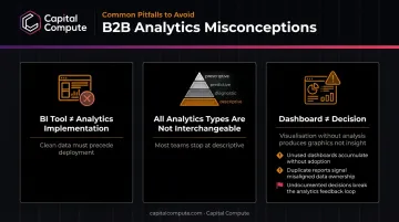
Installing a BI Tool Is Not the Same as Implementing Analytics
This is the most frequent and costly misunderstanding in B2B analytics. Power BI, Tableau, and Looker are visualization and reporting tools. They require clean, structured, connected data to produce useful outputs. Without the underlying data layer, they surface misleading or incomplete pictures with speed and apparent confidence.
Forrester's research underlines the gap: only 20% of non-IT self-service BI users can independently complete the full analytics process — from sourcing and integrating data through to insight delivery. The other 80% still depend on that minority. Deployment is not the same as self-sufficient use.
Three misconceptions account for most of the wasted investment in B2B analytics programmes. Each is worth naming directly.
Treating All Four Analytics Types as Interchangeable
Many B2B teams default to descriptive reporting — summarising what happened — without progressing to diagnostic or predictive analysis. A monthly revenue report is useful. Understanding why revenue declined, and what is likely to happen next quarter, is where decisions actually get made.
Teams that never move beyond descriptive analytics are using a fraction of what the process can deliver.
Confusing a Dashboard with a Decision
A dashboard can show that a metric has declined. It cannot explain why, and it does not prescribe what to do next. Teams that stop at the visualisation stage without completing the analytical cycle are producing graphics, not insight.
The clearest signal that analytics is being applied by habit rather than by design:
- Dashboards that no one consults after the initial launch
- Reports that duplicate information already visible in a spreadsheet
- Visualisations that change regularly but never drive a documented decision
Conclusion
Data analytics and visualisation are not the same process. One produces insight; the other communicates it. B2B teams that conflate the two — or invest in visualisation before properly structuring the underlying data — consistently produce less useful outputs than teams that treat both as connected stages of a single pipeline.
The tools matter far less than the decisions made before selecting them. Expensive BI platforms deployed on ungoverned data, vague business questions, or mismatched visualisation formats will underperform a well-structured pipeline built on modest tooling.
Three priorities consistently separate teams that get value from their data from those that don't:
- Define the question first — visualisation built around a vague brief produces visually polished noise
- Govern the data layer — schema consistency, access controls, and data quality checks before dashboards, not after
- Match format to audience — executives need trend direction; analysts need drill-down; operations teams need thresholds and alerts
Get those right, and the choice of tool becomes secondary.
Frequently Asked Questions
What is data analytics and visualization?
Data analytics is the process of examining structured data to extract business insights. Data visualization is the graphical presentation of those insights through charts, dashboards, and reports. Together, they form a sequential decision-support process: analytics produces the finding, and visualization makes it usable.
What are the four types of data analytics?
The four types are descriptive (what happened), diagnostic (why it happened), predictive (what is likely to happen), and prescriptive (what action should be taken). Most B2B teams operate primarily at the descriptive level and miss the higher-value analysis available through the remaining three.
What is the difference between data analytics and data visualization?
Analytics is the analytical process applied to raw data to produce findings. Visualization is the communication layer that makes those findings understandable to non-technical stakeholders. Without visualization, most of the business cannot act on what analytics produces — and without analytics, visualization has nothing meaningful to show.
What tools do B2B teams commonly use for data visualization?
Commonly used tools include Microsoft Power BI, Tableau, Looker, and Google Looker Studio. Tool effectiveness depends entirely on the quality and structure of the data feeding into them — a well-configured tool on poorly prepared data will produce unreliable outputs.
Do B2B teams need a data scientist to implement data analytics?
Descriptive and diagnostic analytics can be implemented by analysts or business users with the right tools and clean data. Predictive and prescriptive analytics typically require specialist input from data engineers or analytics developers, particularly when the underlying data architecture needs to be built or restructured.
How does data visualization help with B2B decision-making?
Visualization reduces the time non-technical stakeholders need to interpret performance data and surfaces trends that raw tables obscure. It also creates a shared reference point, so cross-functional teams are working from the same facts before a decision is made.